This is a guest post from Amy Meadows of Windows Matter
It’s said that doctors make the worst patients. This might help explain why, as a visual merchandiser, I’m a pretty tough customer! I regularly attend One of a Kind, Renegade and other similar markets searching not only for must-have items but must-do displays. If the booth is cluttered, I’ll keep walking. If the booth lacks focus or signage, I’ll keep walking. But demonstrate creative solutions with color, presentation AND product? Congrats! I’m your new best customer!
How will you get me to stop—and shop? How will you convert me from a browser—to a buyer?
Step 1: Strategic Signage
Don’t you hate it when you stand in lines at a check-in table, reach the front and then you discover that you’re in the queue for H-K but your last name starts with an M? Frustrating! Don’t rely too heavily on the front of a tablecloth (or a tabletop) as your primary vehicle. With folks standing in the aisle, your message just went “mute”.
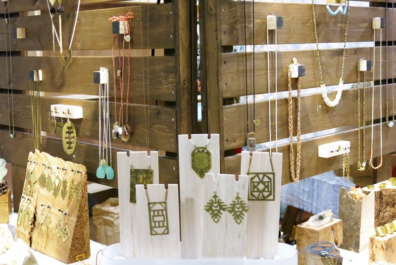
Step 2: Strategic Layout
In essence, your booth is your shop. Your store. Can I move easily in the space? What do I see from the aisle? Have you hidden all your “stuff”? Nothing kills the magic more than seeing a change of shoes and storage tubs.
Step 3: Strategic Merchandising
Sell, sell, sell. Show, show, show. Use your fixtures effectively and efficiently but not at the expense of over-merchandising or bombarding the customer with quantity. Create logical, appealing groups of product—by color, by season, by material or by price. Edit carefully and your customer will love you. Give them a headache and, well. . .not so much!
SLAM-DUNK SOLUTIONS
1. Benchmark
What’s your brand? Are you cutting edge contemporary or do you skew to shabby chic? Make sure your booth reflects your aesthetic–and, by your booth, I mean your tablecloth, your signage, your lighting and your props. Find a retailer or online site whose overall look aligns closely with yours and study it. What inspiration–fixturing–signage methods– can you borrow? Pinterest is also a great resource for image-shopping (both good and bad!)
2. The “squint” test
Yep, it’s a pretty sophisticated-sounding strategy. But here’s the deal–can you see the forest for the trees? If you step back from your booth and squint (literally), what do you see? Balance and order? Or a dizzying array of stuff? You’ll also be able to spot opportunities to re-focus lights and adjust merchandise heights.
Important! If you are doing a craft fair or art show this season, you’ll want to join the next FREE Webinar (this Friday, May 3rd, at 2 pm EST) – all about cheap and cheerful displays for your booth, best layouts, and getting people IN the booth!
Reserve your Webinar seat now at:
https://www4.gotomeeting.com/
About the author, Amy Meadows
 First impressions last! What does your storefront—or booth—say about your business? What level of expertise and customer service do your displays convey? Amy is an industry leader in Visual merchandising and is known for creating clever (and cost-effective) installations in Chicago and around the globe. Follow her on Facebook, Twitter (@windowsmatter) and enjoy Visual Merchandising-focused boards at pinterest.com/windowsmatter.
3 Responses
I love generic instructions on booths. Only problem is an out door set up is totally different from indoor shows. You need a much bigger draw then a sign out doors. I place a large platter of $1.00 kids bracelets in front of booth all different sizes (left over beads) Big sign to advertise them. Draws Moms in to booth and they buy. Indoor shows are fancier use tall pedestals in front with brightly colored large prices in front. Do not care if those sell. Are a come on. Also still place bracelets in front a bit lower then eye level for kids. I can usually sell at least 75-100 at any show not bad for tv stringing time. P.S l will buy pink and purple beads. Little girls love that color.
There are plenty of reasons why crowdfunding platforms have fees and are not free or cheap. First and foremost – they have their expenses as well, especially bigger platforms.But coverrme.com is a crowdfunding site that is free and no charged at all.
The squint test sounded funny due to the name but when you explained it you definitely have a point! Being strategic definitely sounds like your bread and butter so it’s awesome of you to share it with your readers. Visual displays if done well are very enticing so I can totally understand why it’s something you promote. Thank you for this!